What do good email popups look like?
Last updated
12 examples
- Video · Fashion
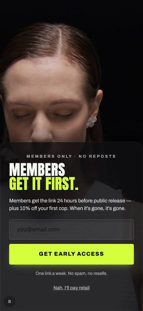
Sell the head start
The headline promises the link a day before everyone else, and the discount only arrives in the supporting line. For a drop-driven brand, being first is worth more than a percentage.
See Fashion — Cinema Black live - Video · Pets
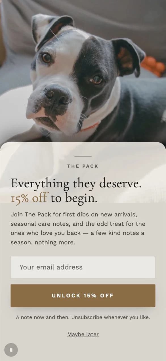
Name the club
Joining The Pack sounds like belonging, not a mailing list. The small line under the button says how often mail arrives, which answers the worry before it is asked.
See Pets — Bond live - Video · Food
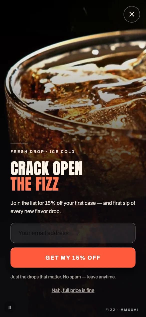
Offer plus a reason to stay
Fifteen percent off the first case gets the signup; first taste of every new flavour gives a reason not to unsubscribe the day after the code is used.
See Food & Drink — Cinema Bold live - Video · Home
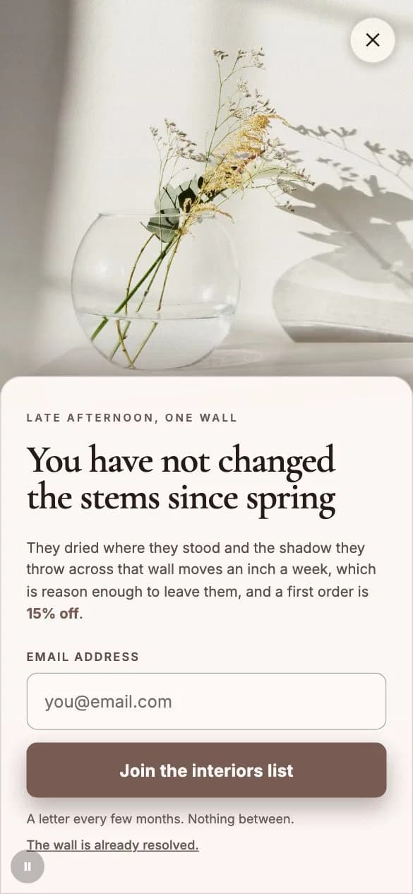
Let the story carry it
Written like a line from an interiors magazine, with the discount tucked into the last clause. It suits a store whose shoppers browse for ideas before they buy.
See Home & Living — Video · Design Authority live - Multi-step · Beauty
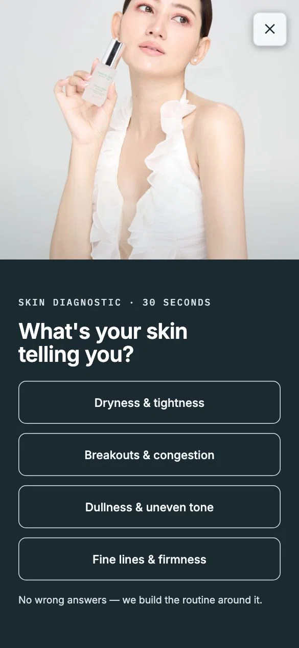
Question before the ask
It opens on a skin question with no wrong answers, then asks where to send the routine. By the email step the address is the way to collect something already started.
See Beauty — Cl Quiz A live - Multi-step · Jewelry
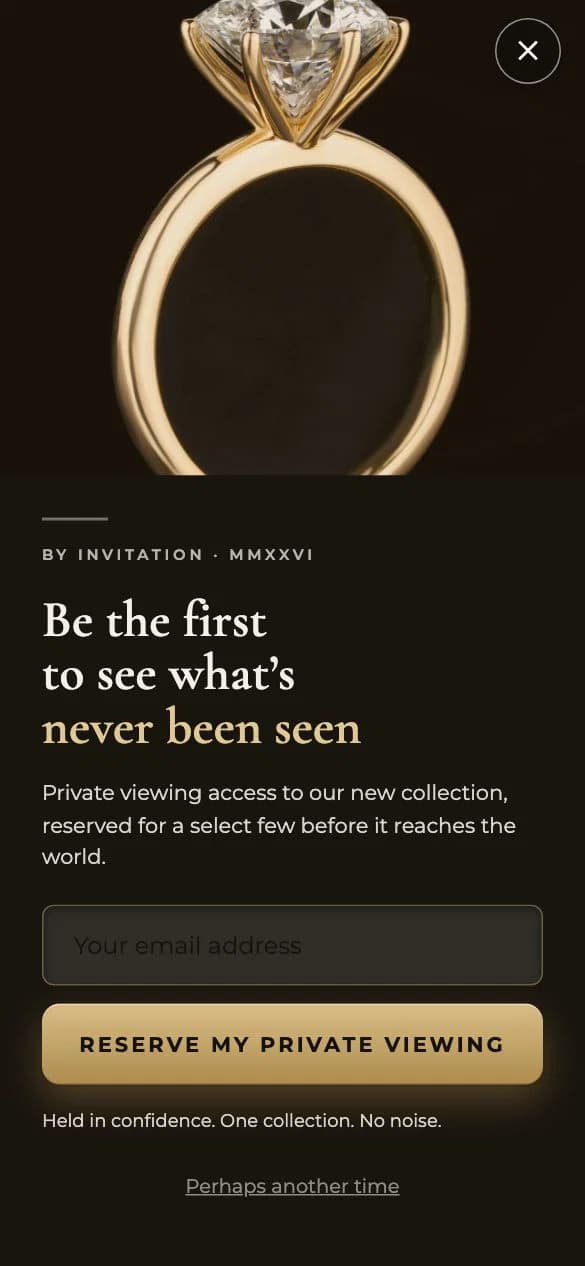
No discount at all
A private viewing, reserved for a few. There is no discount anywhere, which protects the price of a luxury piece and still gives the shopper a reason to sign up.
See Maison — Gold live - Multi-step · Food
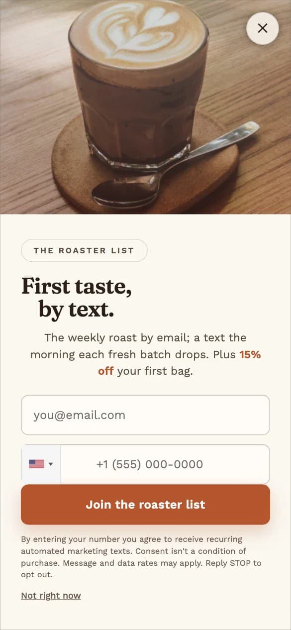
Two channels, two jobs
Email carries the weekly roast and a text only arrives when a fresh batch drops, so each channel has its own promise. The consent wording for texts is spelled out on the same screen, not hidden behind a link.
See Food & Drink — Sms Craft live - Image and minimal · Pets
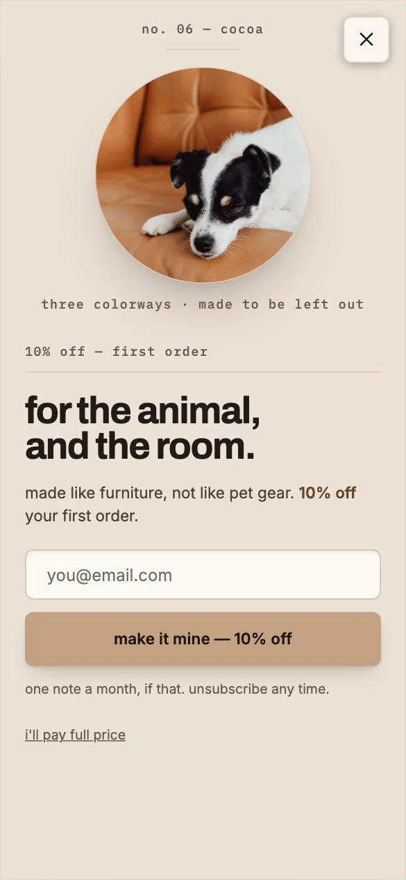
The button restates the offer
Quiet lowercase type and one object on a plain ground. The button reads make it mine, then the discount, so the shopper sees what they get at the exact point of clicking.
See Pets — Mn Object A · Cocoa live - Image and minimal · Pets
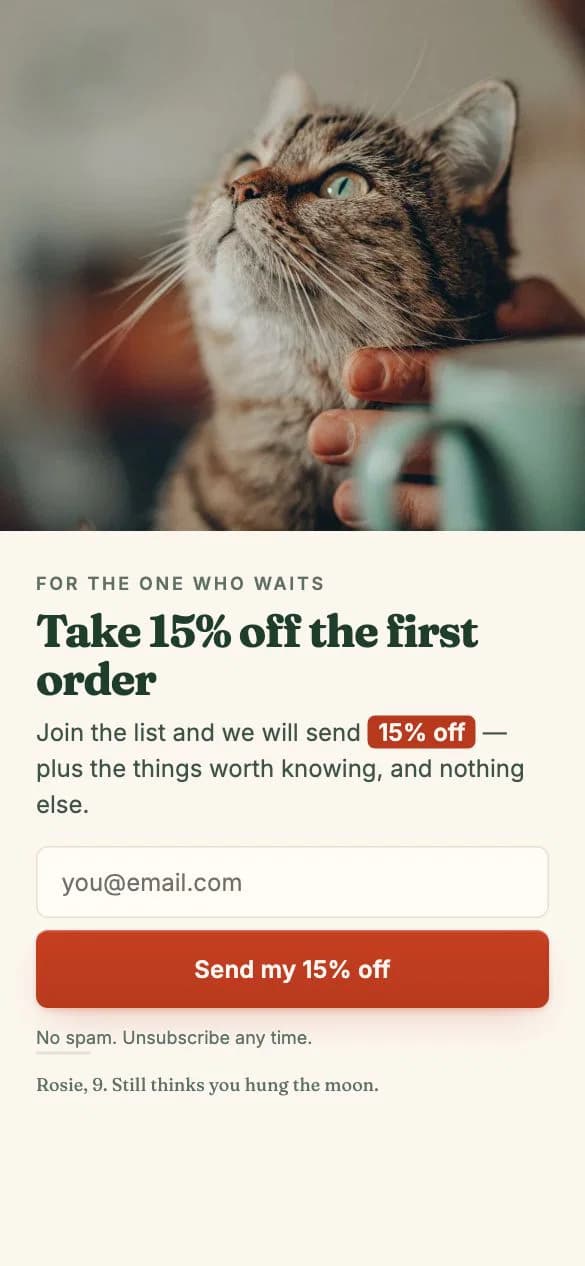
A caption that makes it personal
A photo caption about one particular dog turns a stock discount popup into a small story, and the button says send my discount rather than a bare submit.
See Pets — Bond Image A · Signature live - Game · Food
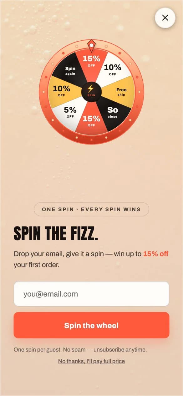
Say every spin wins
The eyebrow line promises that every spin wins, which removes the fear of giving an email for nothing. The prize ceiling is stated up front, so nobody feels tricked.
See Spin the Fizz — Bold live - Game · Pets
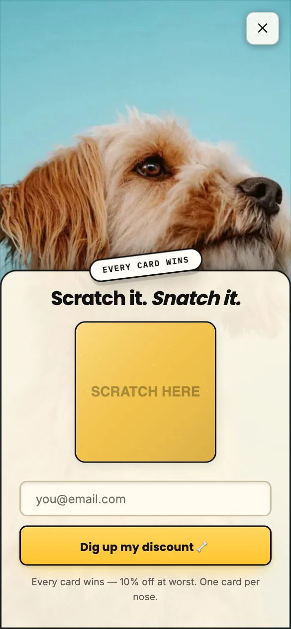
State the floor
Every card wins, with a stated minimum prize. The game adds a moment of play, while the floor keeps it honest: the worst outcome is already a real offer.
See Scratch It, Snatch It — Pup live - Countdown · Jewelry
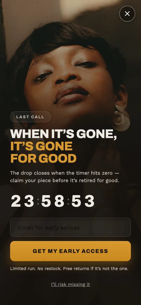
A deadline that is real
The timer is tied to the drop closing, not to an invented rush. The reassurance line about returns sits under the button, where a hurried shopper looks last.
See The Drop — Noir live
What to do with this
Every example on this page is a ready-made template in Nudgesmart, grouped by industry and campaign type.
- 14-day free trial for first-time subscribers on paid plans, no credit card required
- Setup help included, no setup fee
- Support email goes straight to the founder
- No overage charges
Run this on your store with Nudgesmart.

What to look for in each example
An email popup example is a real signup popup you can study before designing your own, and the useful part is the reason behind each choice: of the 12 below, the jewellery popup offers a private viewing with no discount at all, while the scratch card states its smallest prize up front so nobody feels tricked into giving an address.
Every example is a template from the Nudgesmart library that collects an email address. The notes describe design choices; none of them reports how any popup performed.
Each card names one idea the popup gets right. Filter by the style you have in mind or by whether you want to lead with a discount, then open any card to see the popup running.
- The offer
- What the shopper gets for the address: a first-order discount, early or private access, a result such as a routine, or a prize. The filter separates popups that lead with money off from those that lead with access.
- The first line
- The eyebrow or headline a shopper reads before deciding whether to read on. The strongest ones say what is on offer in a handful of words.
- The button
- Most of these examples repeat the benefit on the button itself, such as unlock or send my discount, rather than a bare submit.
- The reassurance line
- The small print under the button: how often mail arrives, that unsubscribing is easy, or what the returns policy is. It answers the doubt at the moment of clicking.
- The decline link
- How a shopper says no. A plain maybe later is kind; a line that mocks the shopper for declining can put people off the brand.
- The style
- Video, multi-step, game, countdown or a still image. Style sets the mood and the effort asked of the shopper; the offer and the words still do most of the work.
Nudgesmart is available on the Shopify App Store. Browse the template library or see what it costs.
Which examples fit which kind of store
Six store situations and the examples on this page that suit each one, picked by the same filter the page above uses.
| Store situation | Examples that fit | The idea to borrow |
|---|---|---|
| A store that would rather not lead with a discount | Fashion — Cinema BlackMaison — GoldThe Drop — Noir | Sell the head start; No discount at all; A deadline that is real |
| A brand with strong product footage | Fashion — Cinema BlackPets — BondFood & Drink — Cinema BoldHome & Living — Video · Design Authority | Sell the head start; Name the club; Offer plus a reason to stay; Let the story carry it |
| A store where shoppers need guidance | Beauty — Cl Quiz AMaison — GoldFood & Drink — Sms Craft | Question before the ask; No discount at all; Two channels, two jobs |
| A store that wants a playful first visit | Spin the Fizz — BoldScratch It, Snatch It — Pup | Say every spin wins; State the floor |
| A minimal brand with a calm site | Pets — Mn Object A · CocoaPets — Bond Image A · Signature | The button restates the offer; A caption that makes it personal |
| A limited release with a real end date | The Drop — Noir | A deadline that is real |
Before you copy an example
Borrow the idea, not the words
The notes explain why a choice works. Copying another brand headline word for word rarely fits your voice, your products or your offer. Rewrite the idea in your own terms.
An offer you cannot afford is not a template
A first-order discount works only if your margin can carry it. Work out what the code costs before copying a popup that leads with money off.
These are designs, not results
Nothing on this page says how well any example performs. How a popup does depends on your traffic, your targeting and your offer, and only a live campaign can show that.
Check every example on a phone
Plenty of shoppers will meet your popup on a small screen. Open the live version of any example you like at phone size before you decide it is the one.
Questions about email popup examples
What makes a good email popup?
A clear reason to sign up, said in the first line; a single field where possible; a button that repeats what the shopper gets; and a small line under it that answers the obvious worry, such as how often you will email.
Do I have to offer a discount?
No. Early access, a private list, a quiz result or a guide can all be the reason to sign up. Stores that protect their prices often lead with access instead of money off.
Should I use a game such as a spin wheel?
A game adds a moment of play and suits a fun brand, but it should be honest: say that every spin or card wins if it does, and state the prizes clearly.
Can I use these templates on my store?
Each example is a template in the Nudgesmart library. Open a card to see it running, with its own page describing the design.
How were the examples chosen?
They cover different popup styles and industries, and every one collects an email address. Each was picked because it shows one idea clearly, not because of any performance figure.
Borrow the idea, then make it yours.
Nudgesmart starts from ready-made templates, grouped by industry and campaign type, and shows them to the shoppers you choose.